Blog Post #1 – Political Implications

I’ve seen this headline a few times today on Facebook. Vox is a very liberal news agency who regularly posts things that are against Trump. ABC News tends to lean left, but is more recognized as a neutral source. These articles are talking about the same policy change that went into affect on October 1, 2018, but they are very different in wording and in their pictures. Vox uses words like “forced” and “leave” while ABC News is a bit more unbiased. The photos show completely different things as well, with the picture on the left showing snipers with Pride flags in the foreground and the photo on the right shows Trump and the US flag. Both of these are telling a story just within a short paragraph, a headline and a photo and gives the audience a bias before they even click in. Both of these can be taken in different lights by each political party, but it’s clear that Vox is appealing to Democrats and those who do not care for Trump while ABC is more appealing to both sides. I see this all the time with the same story being told with slightly different words to target one political party or one social group. When viewing media content, we have to ask ourselves who is writing it, who are they writing it for and what kind of biases do they have at the time this was created. It’s important to note these things so that we can find for ourselves what that media can mean to us and the world around us.

Photobook

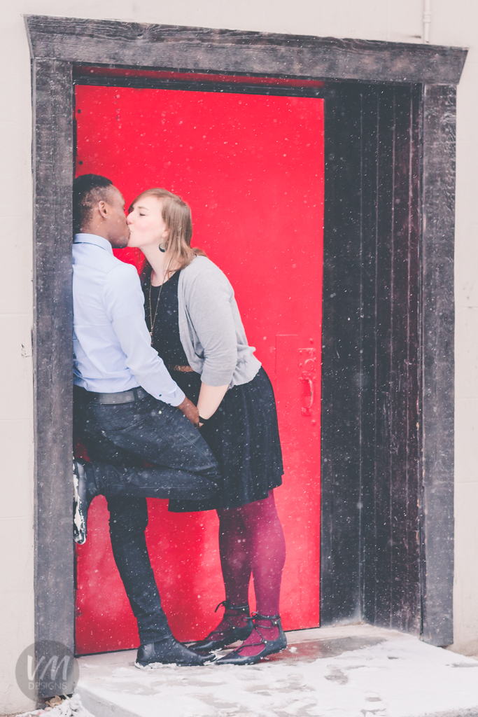
This photobook is a collection of photographs taken through out the Winter semester for COMM 300. From portraits to landscapes and every object and angle in between, this is the best of what I have done the last three and a half months.

I have loved this class and I am very pleased with my work. I have grown exponentially in my knowledge and skills with a DSLR and auxiliary lighting, editing in Adobe Camera Raw, Lightroom and Photoshop, and successful capturing techniques.

Photobook Cover
Valarie McAllister (Heine) Photobook

Photo Contest


color_me_american_blog-1
“Color Me American”


I uploaded this photo to a street art photo contest. I added tags, a brief description and categories to maximize exposure.

I love graffiti and street art and I had the perfect picture to submit, which is why I chose it. Street art is fascinating and interesting because there is always a story about why it’s there, what it means and why that place was chosen and most of the time we’ll never know.

https://www.viewbug.com/contests/street-art-photo-contest/gallery?new&join

Entered 3/24/2018

blog-2

I entered this photo into a contest called “It Is Red”. I added tags, a description and categories to help boost the photo. I didn’t include my watermark though.

This is one of my favorite photos because the blue background makes the red rose pop. I thought it would go well in a contest about red objects. I picked that contest because you can win a light as well. I am hoping the clarity, macro depth, and the uniqueness of color choices will do well.

https://www.viewbug.com/contests/it-is-red-photo-contest/gallery?new&join

Entered 3/24/2018

REP Sponsored Promotion

REP Sponsored

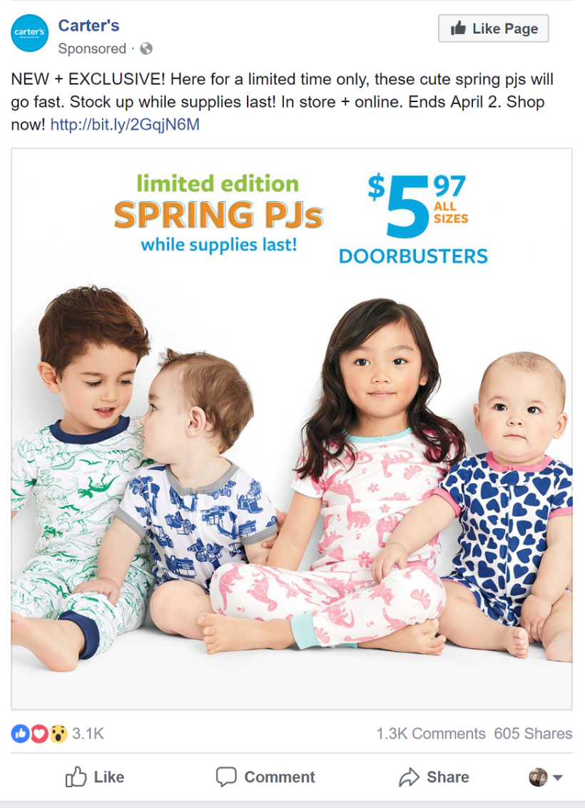
The ad’s strength is that it is easily recognizable by the target audience. I have a young child and I definitely was interested immediately by the cute prints and cute babies. It is bright and airy and the colors are very inviting. I love the set up of the photo with the babies looking different places and it is crisp and clear. The wording looks well with the urgency in the call to action.

The ad is lacking with diversity (especially with the social climate these days.) I think it would be helpful of the babies were a bit different in skin color, but that’s not a huge sticking point. I think there were too many words. I didn’t read it all when I was scrolling. They could omit “in store and online.” I also think the plus instead of the word and is odd, but not really a negative.

The ad is definitely trying to make their target audience (probably women with children or nieces and nephews) say “awww” and want to get one for the children in their life. You can tell the ad is for warmer weather too which mom’s might be shopping for at the moment so it is relevant.

There’s a lot of white space that draws the eyes to the colors of the pajamas. The faces are also not centered and that draws the eyes there and then leads the eye to the words above the children. It works well, especially since nothing in the photo leads the eyes off the page.

Likes and shares are the biggest social media metric, comments are also great for raising it in the news feed. Ultimately it’s the click-throughs and any uptick in purchases of those pajamas that will show the most success. The ad is doing pretty well from the 3 thousand likes and over 500 shares.

Final Print

final_print_valarie_heine
Final Edit
for print-1-2
Original Photo

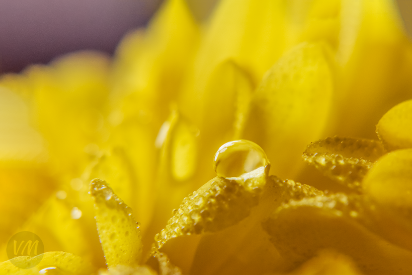
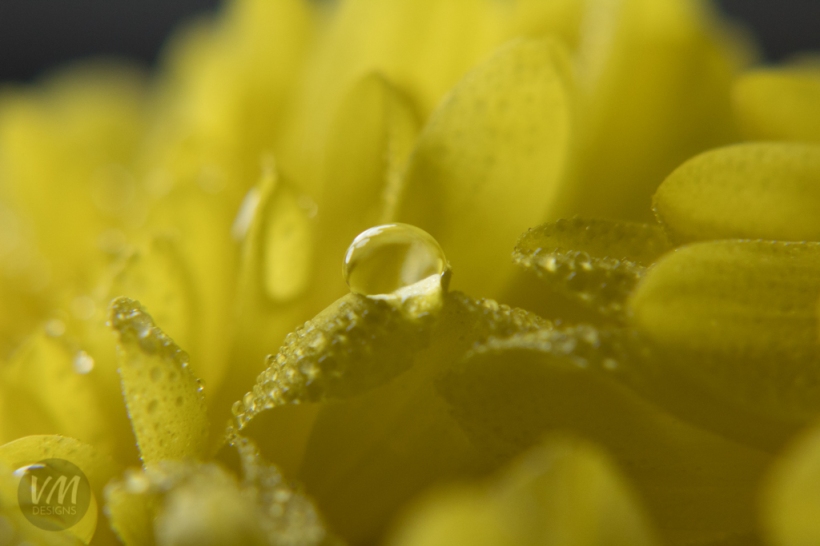
This was during our class shooting session with macro filters. I used a continuous light and a little dropper to get the water droplet just right. I loved the colors and the focal point, which is why I chose it. I used Adobe Lightroom to lighten the shadows and darken the highlights, and then I opened it in Photoshop. I used the content aware fill to make the water droplet more on a third line. I changed the colors so it would be more warm and vibrant.

REP Social Video

https://www.facebook.com/plugins/video.php?href=https%3A%2F%2Fwww.facebook.com%2FCWLifeSentence%2Fvideos%2F2030080350342641%2F&show_text=0&width=560

This is an ad for a new TV show about a girl who beats cancer and now has her whole life to look forward to.

One of the strengths it has is that it has a the whole gamut of emotions in it, humor, joy, fear, sadness, melancholy, love. It’s easy to digest, I understood the plot of the show quickly. It is intriguing with it’s first few seconds and catches the attention of it’s targeted audience. The lighting and color is consistent, no scene feels out of place. The music used in the background was not distracting and worked well with the feel of this show and ad.

Something it struggled with was it went a little too quick. I had to rewind three times to catch the doctor saying “you’re cured” which is a huge part of why this show is intriguing.

The video is definitely intended to look like a modern day drama comedy. It has a very CW/ABC Family feel. It wants to be upbeat and funny and it comes across that way.

Faces are definitely a focal point throughout the video and it’s well done in the design of having them on a third line or the only thing in focus. The wording that describes the show has good contrast against the background and is a readable font.

Views and shares are the biggest measure of success in the social media aspect, but how many people watch the show and if there is an increase after releasing an ad, is the most important metric they can measure. Likes and comments are not significant for this kind of ad.

Hope – A Conceptual Project

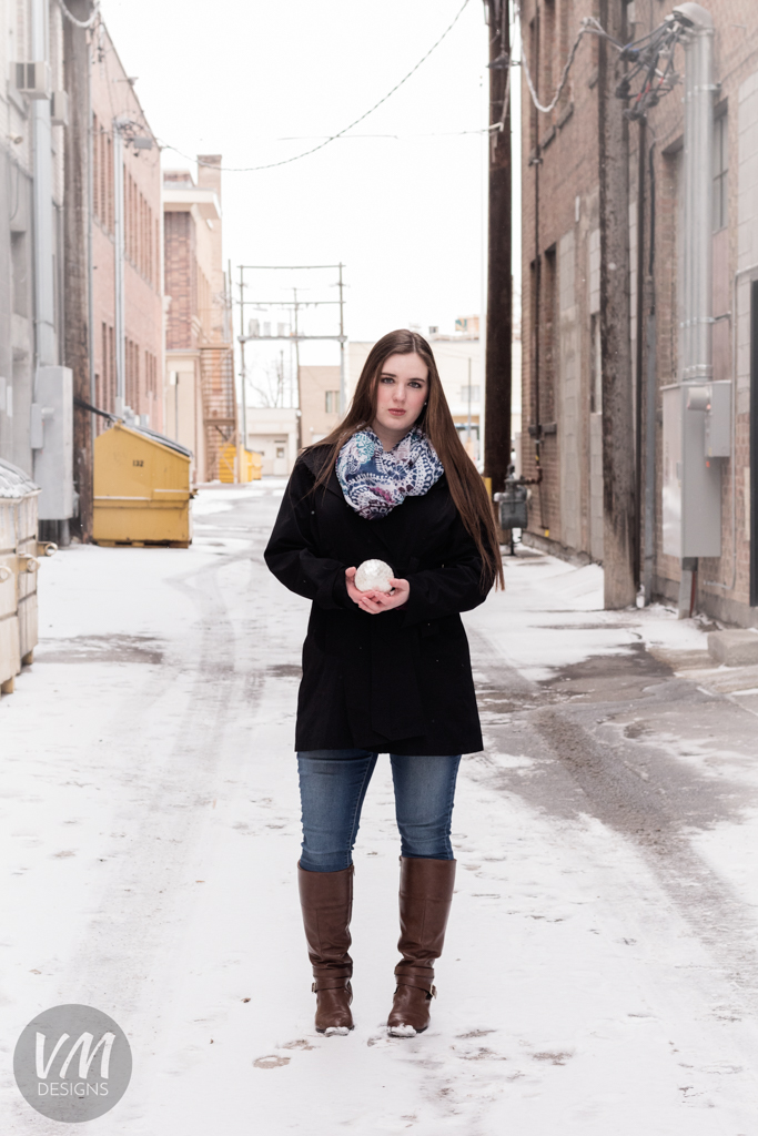
You can find hope, you can give hope or you can be hope.

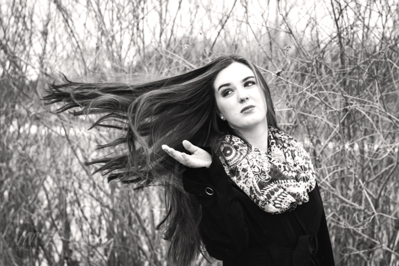
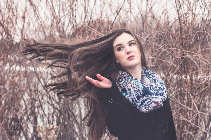
I wanted to portray hope in someone’s life. I invited my good friend to be my model and we set out to find a prop. We found this beautiful little scaled ball at Hobby Lobby made of shell. It was opalescent and beautiful and stood out among the other trinkets. We bought and found a grungy alley and decided to go for it. I wanted to show that hope can be found anywhere and it can even be ourselves.

It was snowy and windy, which didn’t make for great shooting conditions but the cold helped the photos to stand out more. I used the natural lighting and my Canon Rebel T6 with my 50mm prime lens. I processed them in Adobe Lightroom and then Photoshop.

Photobook-21-2Photobook-30Photobook-31Photobook-32Photobook-33